The python code for this project can be found at here.
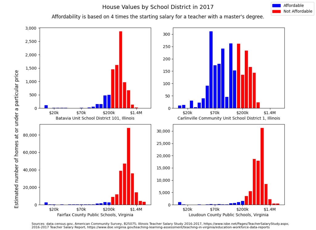
A comparison of housing values and teacher salaries in two Illinois communities; the rural, county-seat Carlinville School District, and the suburban Batavia School District, and two Viriginia communities; the D.C. metropolitan area Fairfax and Loudoun County school districts.

This is my first completed Python data visualization project using matplotlib. The housing data comes from the U.S. Census 2017 American Community Survey and the teacher salaries from the 2016-2017 Illinois and Virginia Teacher Salary Reports.
This project was born from a conversation I had with a Batavia, Illinois teacher who has a friend living in Virginia’s Loudoun County and teaching in Fairfax County. The Batavia teacher was surprised that her Fairfax County friend, having similar seniority in the school district and similar education, was earning less than her.
There are a couple of glaring difficulties with my data analysis. First of all, I had no business comparing school districts of such a variety of communities. In 2017, the populations of Carlinville, Batavia, Loudoun County, and Fairfax County were 5,591; 26,493; 397,192; and 1.149 million, respectively. A school district in Illinois consists of one town and sometimes even just part of a town. In Virginia, school districts are entire counties. Aside from the moniker of “school district,” these data buckets are not particularly comparable. The Census data is so neatly organized that, were I to do this project again, I could look at housing values in specific towns in Virginia or, conversely, look at counties in Illinois.
Secondly, it is unfair to compare the rural Macoupin County (of which Carlinville is the county seat) to the suburban Kane (Batavia) and Loudoun counties to the very urban suburb of Fairfax County. In a second attempt at this project, I would begin with a study of population densities and only compare regions within similar ranges.
On the other hand, this was my first true data visualization project. The Census data and the Teacher Salary Reports are filled with cleaned and summarized data so I could place my efforts into building a nice collection of charts using matplotlib. I am particularly proud that I assigned two different colors to the bars in my bar charts. Any house valued at or less than 4 times that region’s starting salary for a teacher with a master’s degree was colored blue and remaining house values were colored red.
I also learned to post text all over the figure. However, I still have not managed to convince matplotlib to make the subplots smaller so that readers can see the source information without a magnifying glass. I also learned to format and space the tick marks on the charts.
The python code for this project can be found at here.